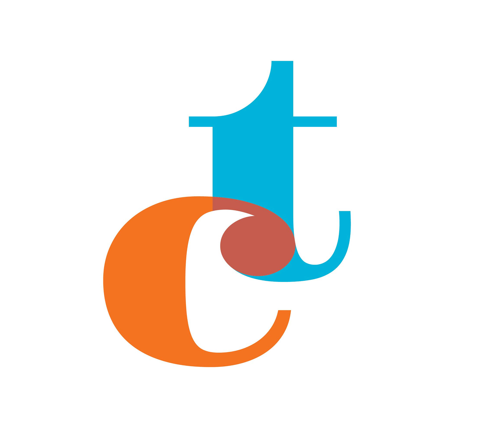
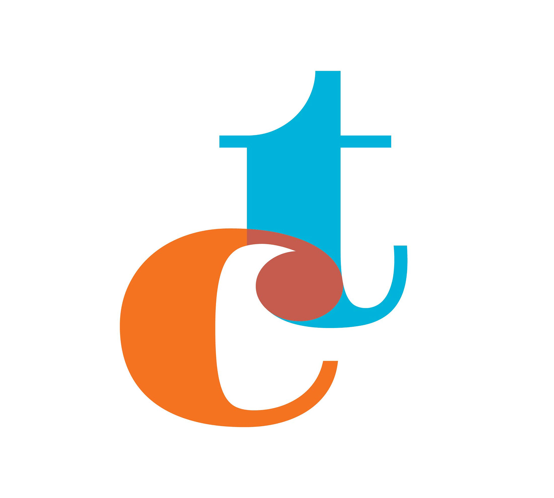
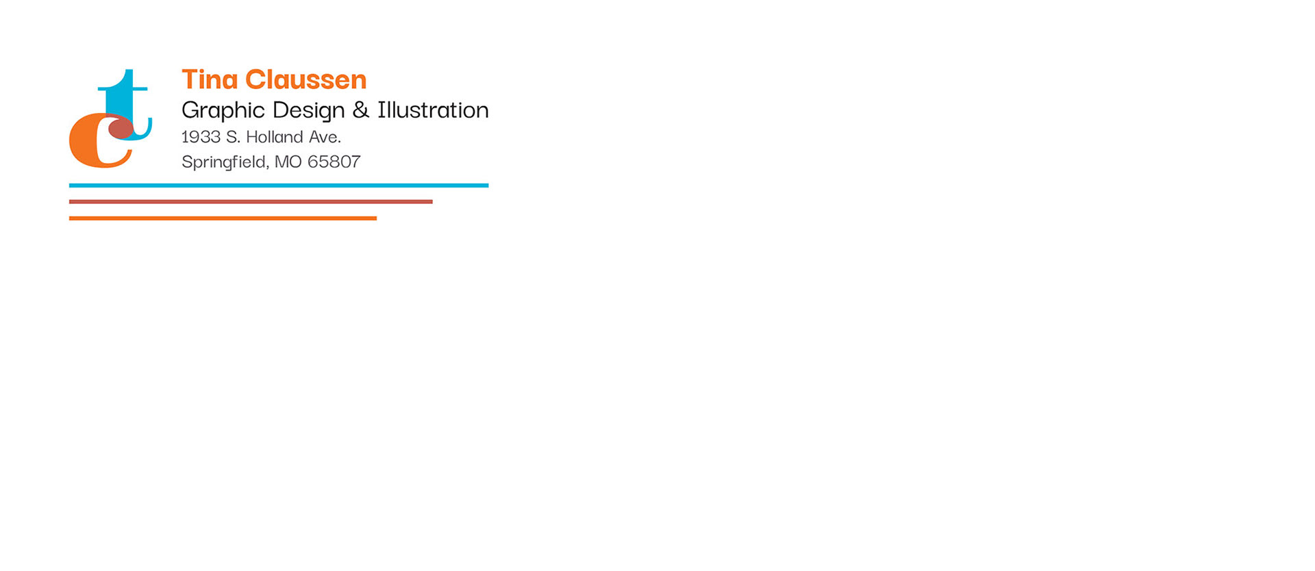
A brand identity developed for my professional website which included a logo, header (for use on stationary and business cards) and a color palette. Developed from a concept first created in my Advanced Typography class, but was refined and edited for this use.
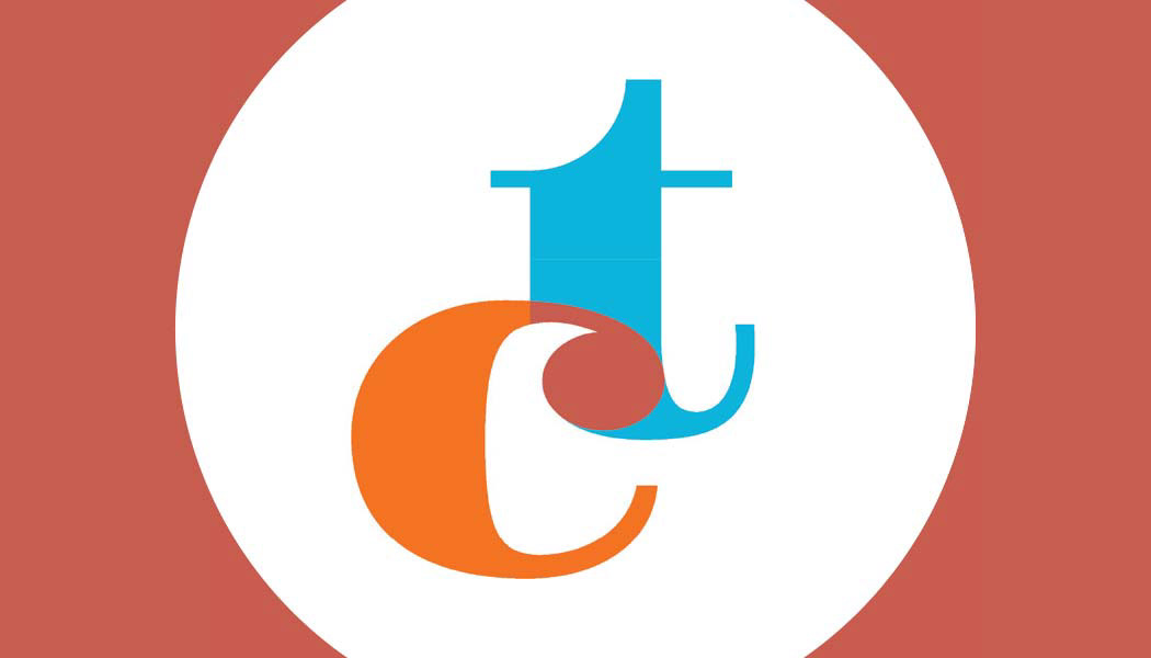
I chose bright complimentary colors of blue and orange. The third color (rust) where the two letters meet is the result of blending the blue and orange.
The typeface used for the logo seen on the left is a modified version of Gravitas One.
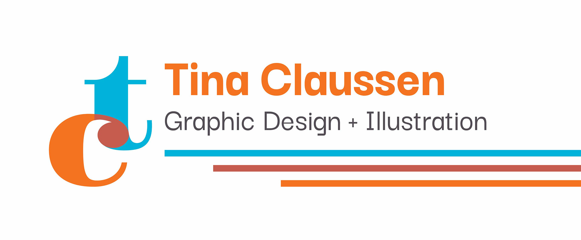
Logo and header
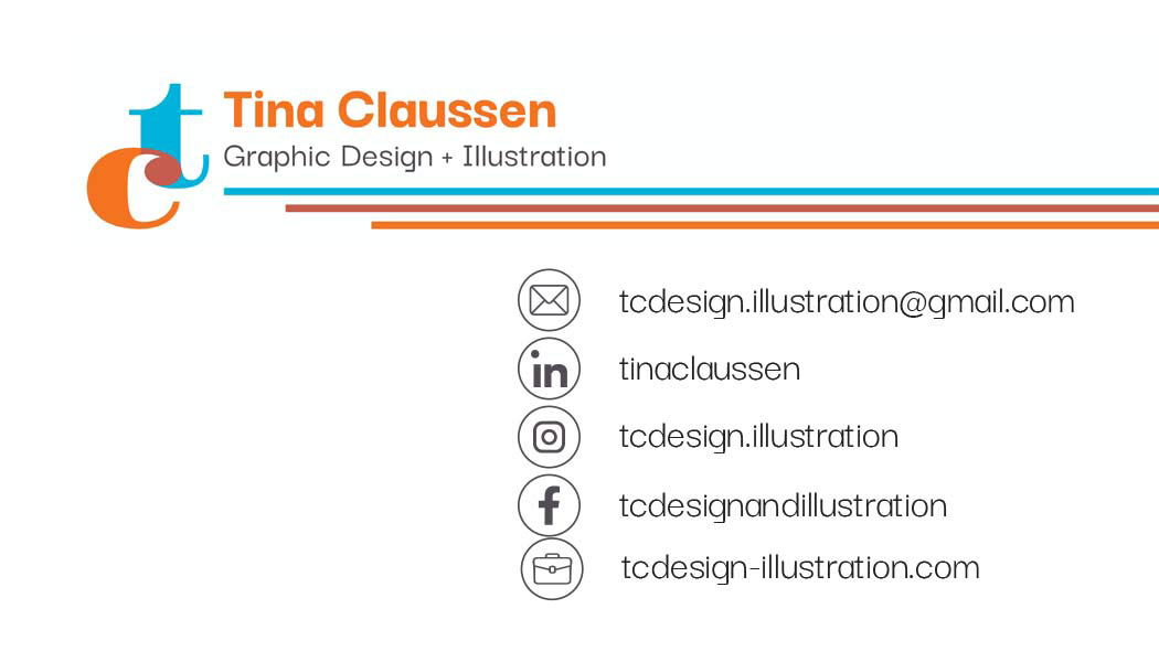
For the logo, I chose bright complimentary colors of blue and orange. The third color (rust) where the two letters meet is the result of blending the blue and orange. Since the logo's color palette is vibrant, I chose a gray color for the text in the header and the main body of whatever text would be found on the stationary.
The typeface used for the logo seen on the left is a modified version of Gravitas One, and the text on the header is Darker Grotesque.
Stationery (letterhead and envelope)
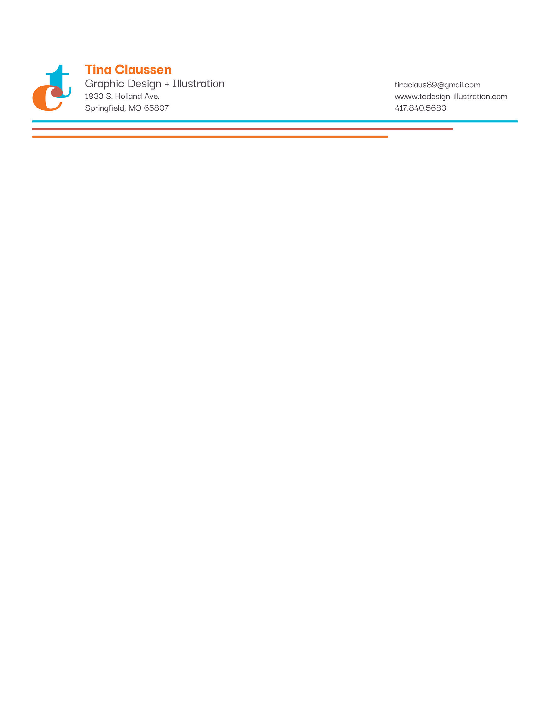
The stationery would be used for resume, references and cover letter. It could also be used for invoices and other client communication for freelance work.
business card
To the left is the front and back of the business card. The back features the header from the stationary and contact information. The front has the primary logo in a white circle surrounded by the rust color that is also found where the "t" and "c" meet.