
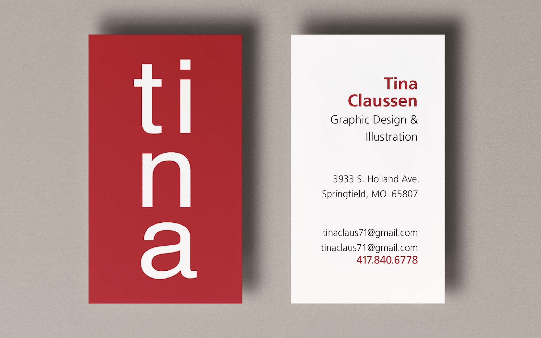
While this logo appears simple, it was very difficult to construct. The first challenge was to find a typeface which was small/narrow enough to allow pairing the “t” with the “I’ and that also contained an “a” that balanced the “n”. Helvetica was my choice and solved all of these problems. However, the challenges did not end there. The default position of the dot on the “I” needed some adjustment. Also, the “a” is optically rather than mechanically aligned to the rest of the letters I in order that its spine align to the “n”. (2023)