This was a comprehensive project for an advanced graphics course. We were asked to create a brand name, logo, tagline, color palette, brand guidelines and a social media campaign for a gender neutral skin care line.


PROCESS-logo
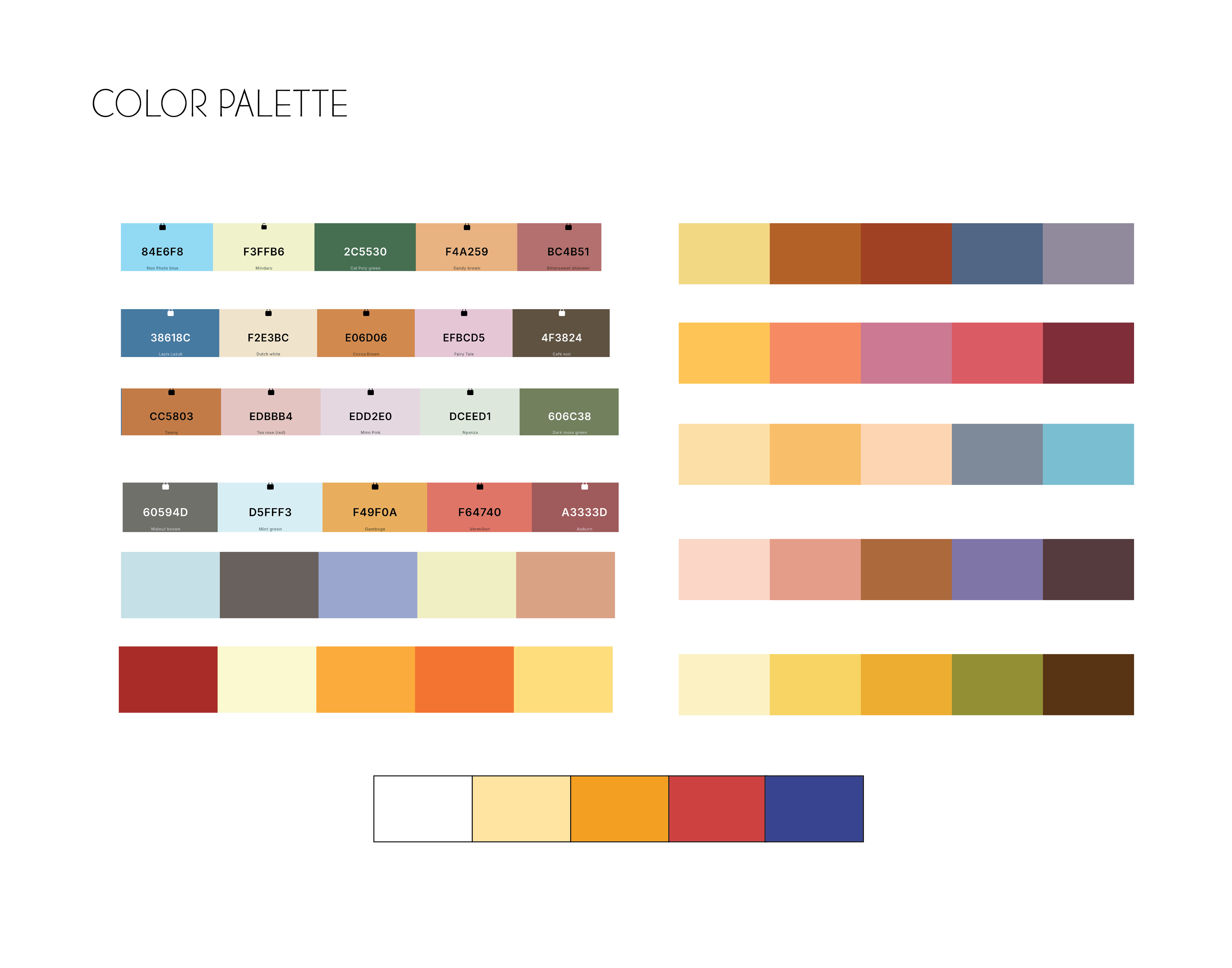
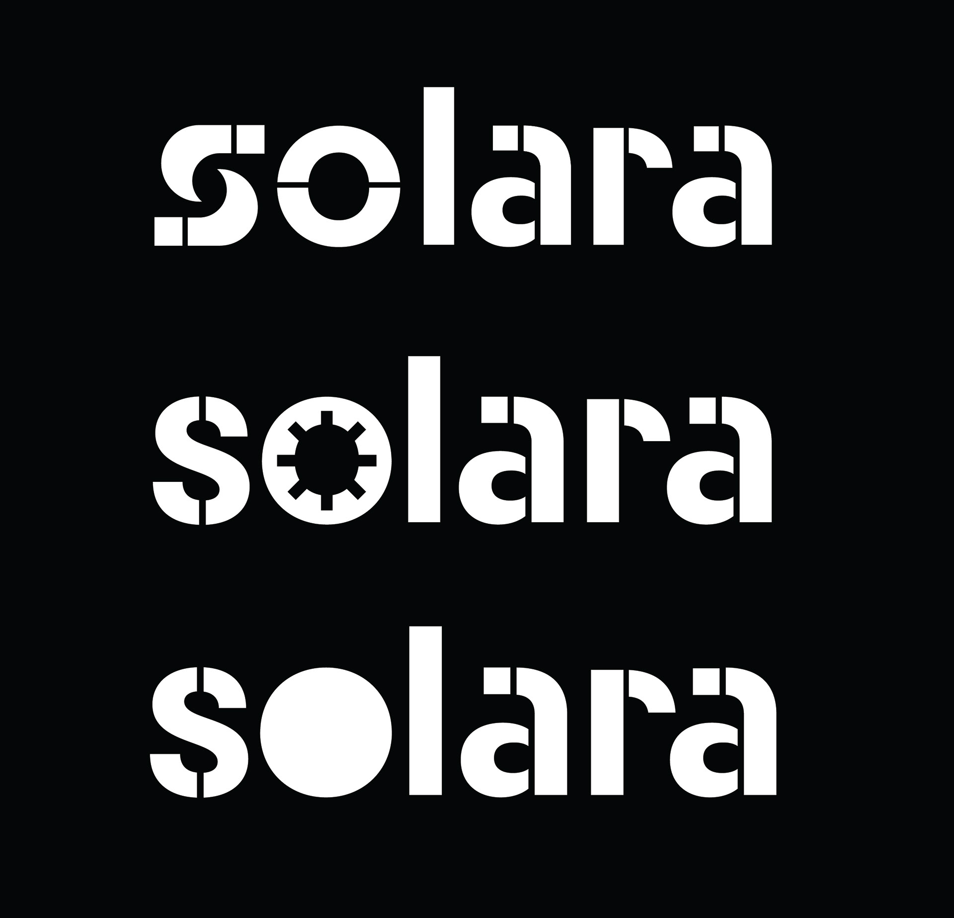
The initial logo sketches (and the final logo) uses Neighbor Stencil Bold. I initially liked this typeface as I thought the splits in it were reminiscent of the sun's rays. I worked on modifying the "o" in that typeface to make it more unique, which led to the logo in the middle panel. I was also working on color palette and landed on one that was shades of orange, red and blue (the bottom palette in the final panel).
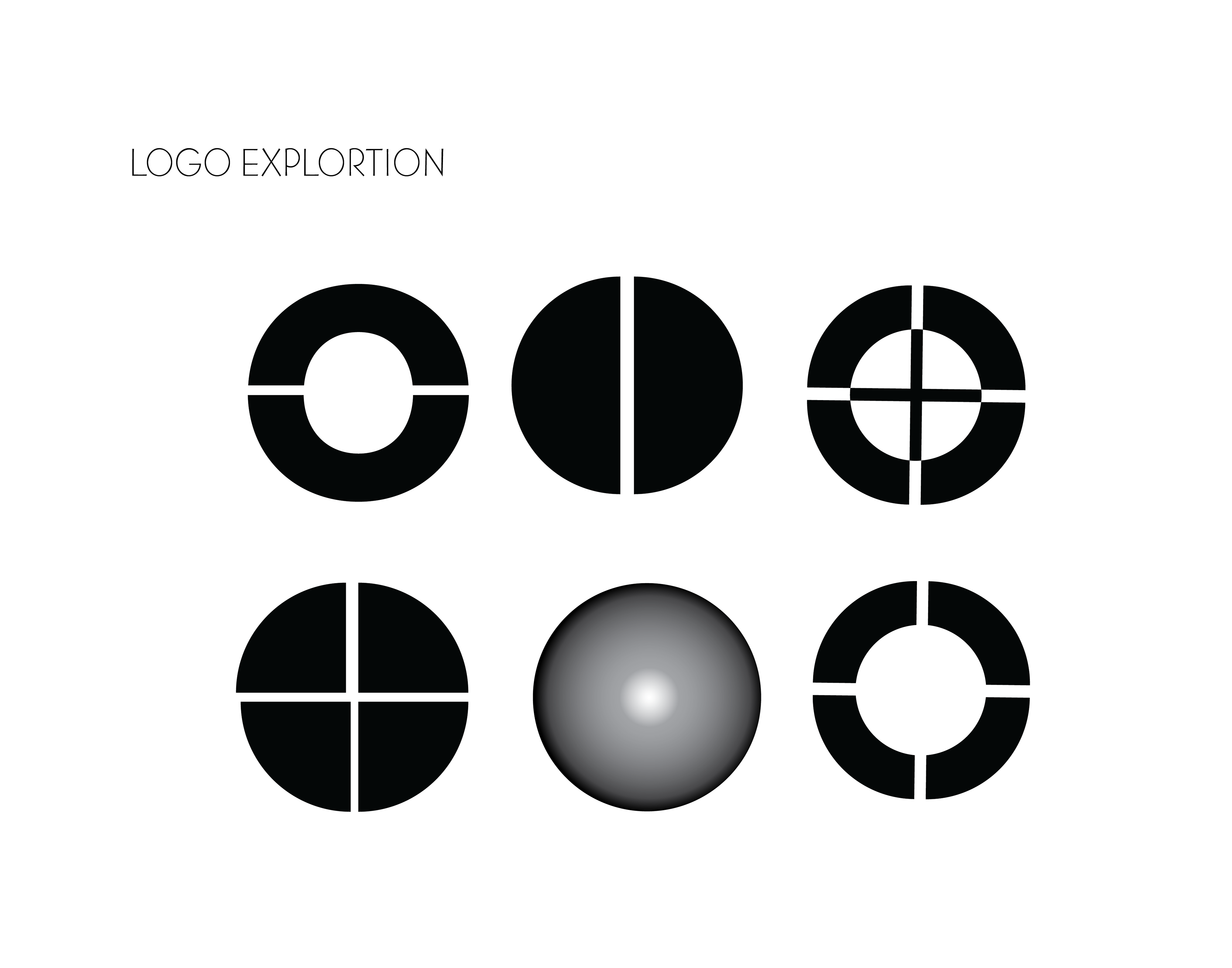

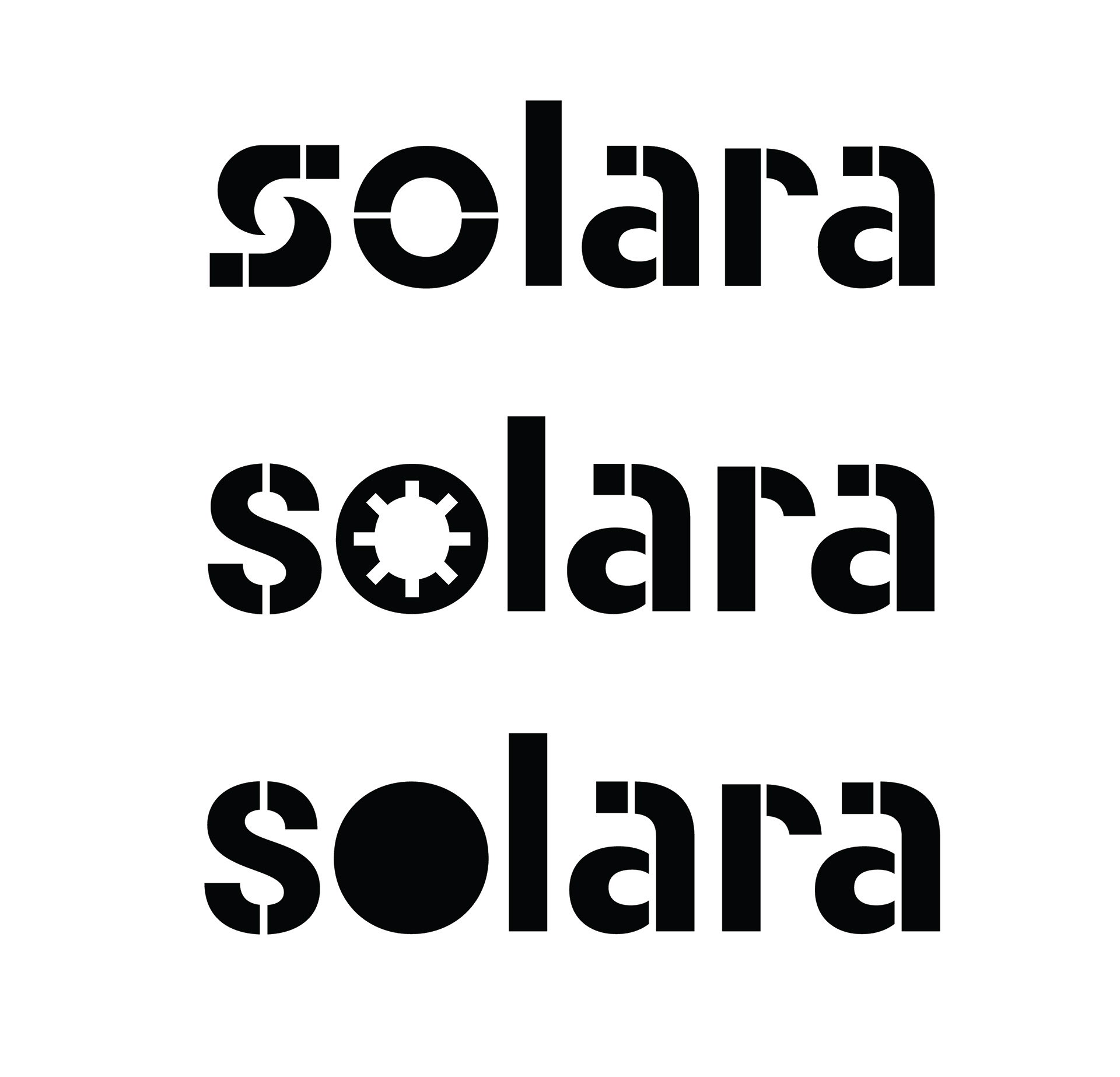
Ultimately, I decided the initial concept was not unique enough. In addition, the resulting symbols too closely resembled targets and other imagery associated with weaponry-not something that aligns well with a cosmetics brand. More exploration led to the concepts below, which were closer, but still not quite right.
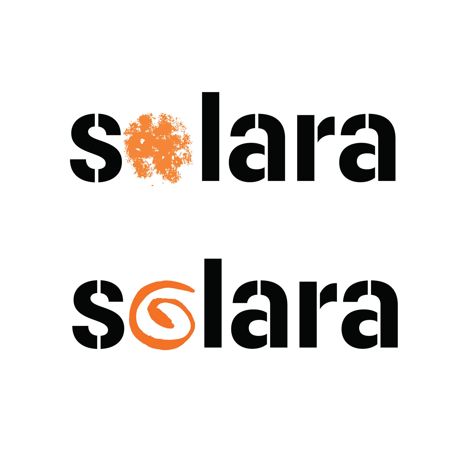
The next step in the evolution of the logo was to take some of the concepts above and use more organic imagery. I had some ink and pen textures and shapes I used to create the next round of iterations, which became the final logo (with the original Neighbor Stencil bold typeface.
PROCESS-packaging
Packaging was the next step. Below were the initial attempts at packaging design. I used geometric forms, patterns and parts of the logo. Logo and packaging were evolving at the same time, so you'll see multiple versions of the logo in the packaging iterations.
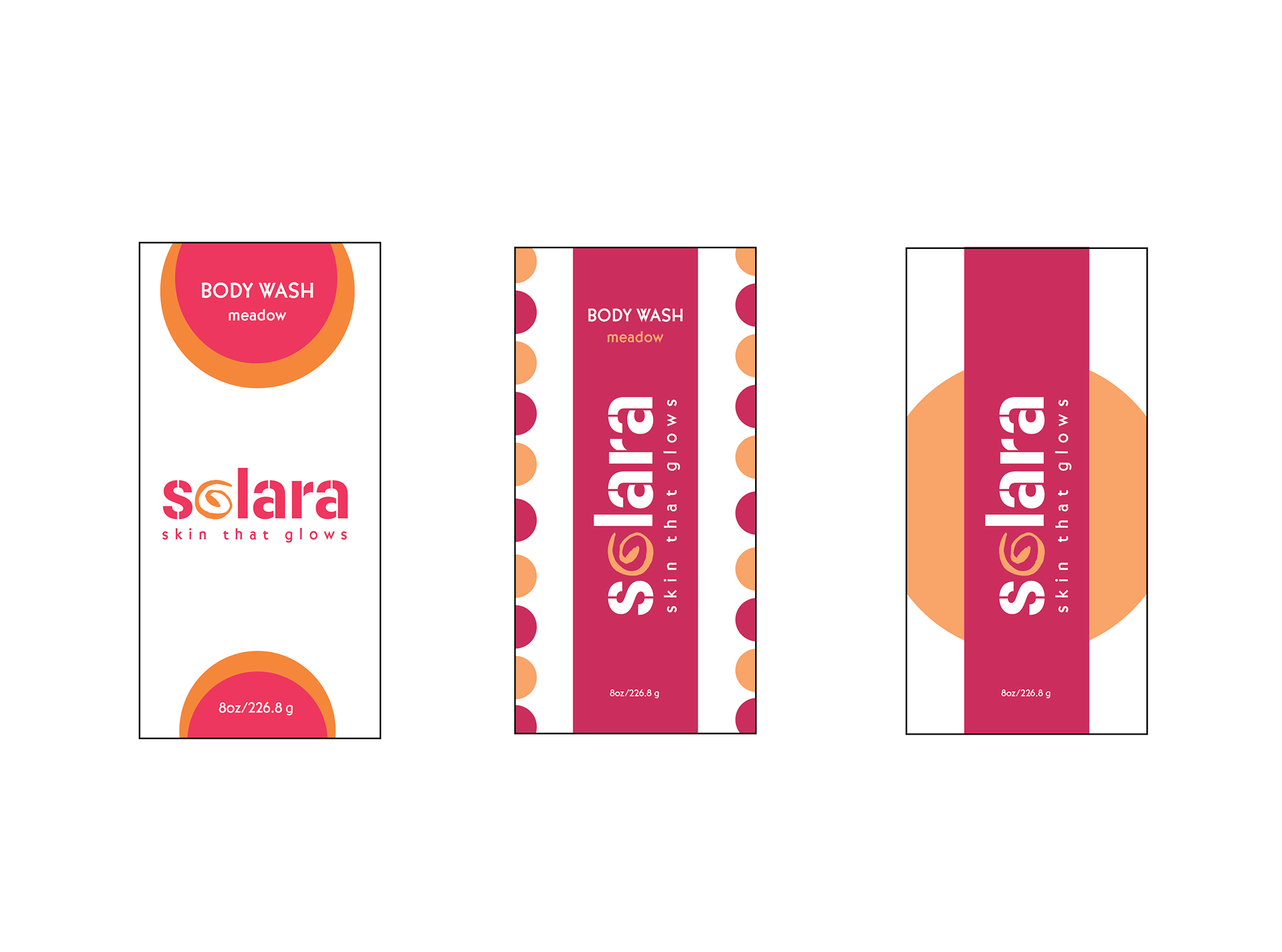
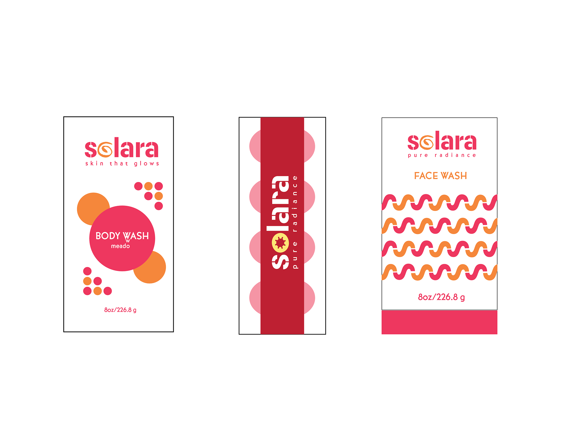
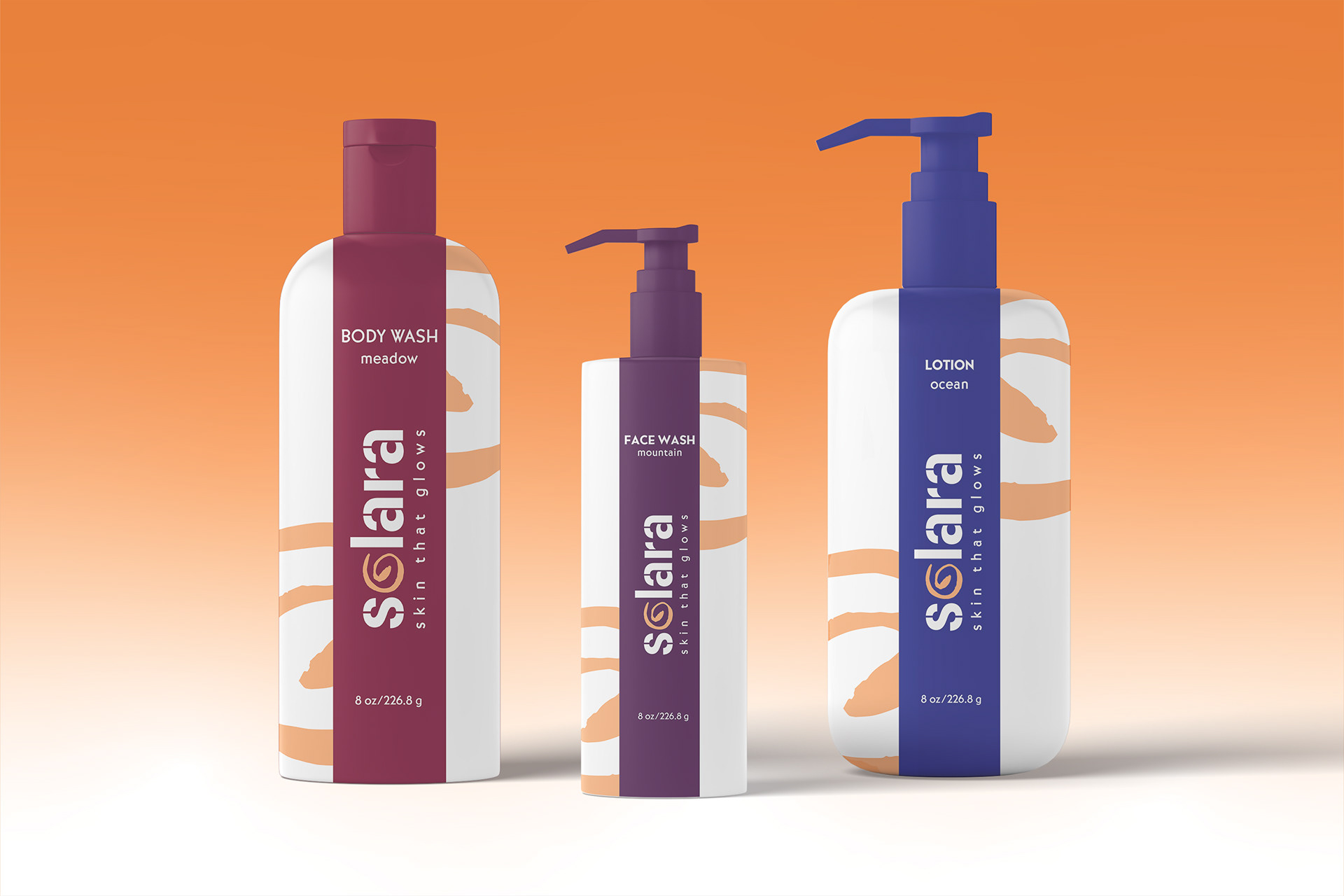
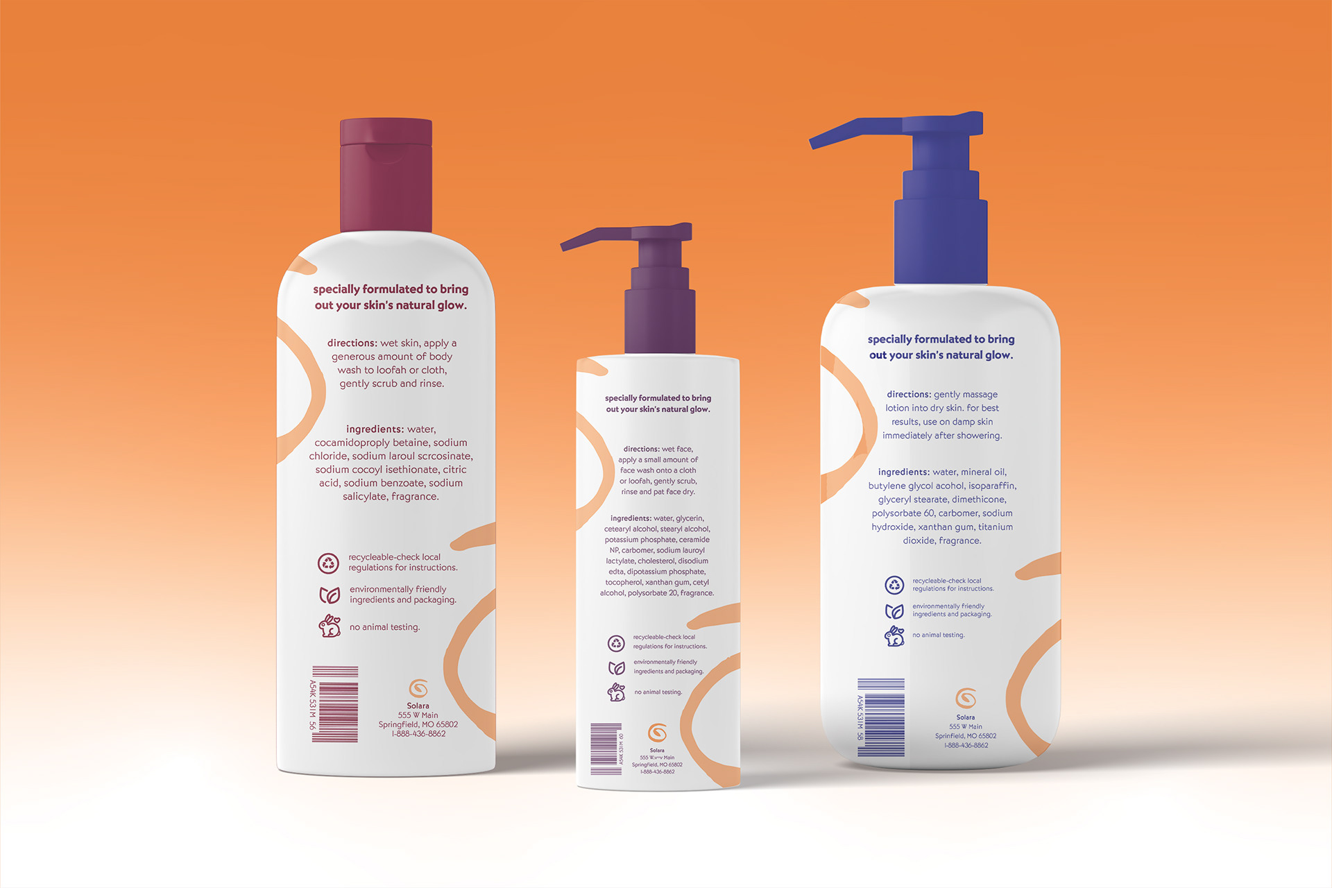
I liked elements of the packaging designs above, but they were either too busy or not cohesive enough. The bold vertical stripe made the packaging more vibrant, distinguishing it from others in a similar product space. The patterns and geometric forms seemed to busy, so they were eliminated. The new logomark of the spiral "o" was distinctive, so I decided to combine it with the bold vertical strip to come up with the final version of the packaging. The color palette was also modified for both legibility and ease of use across various products and applications.