
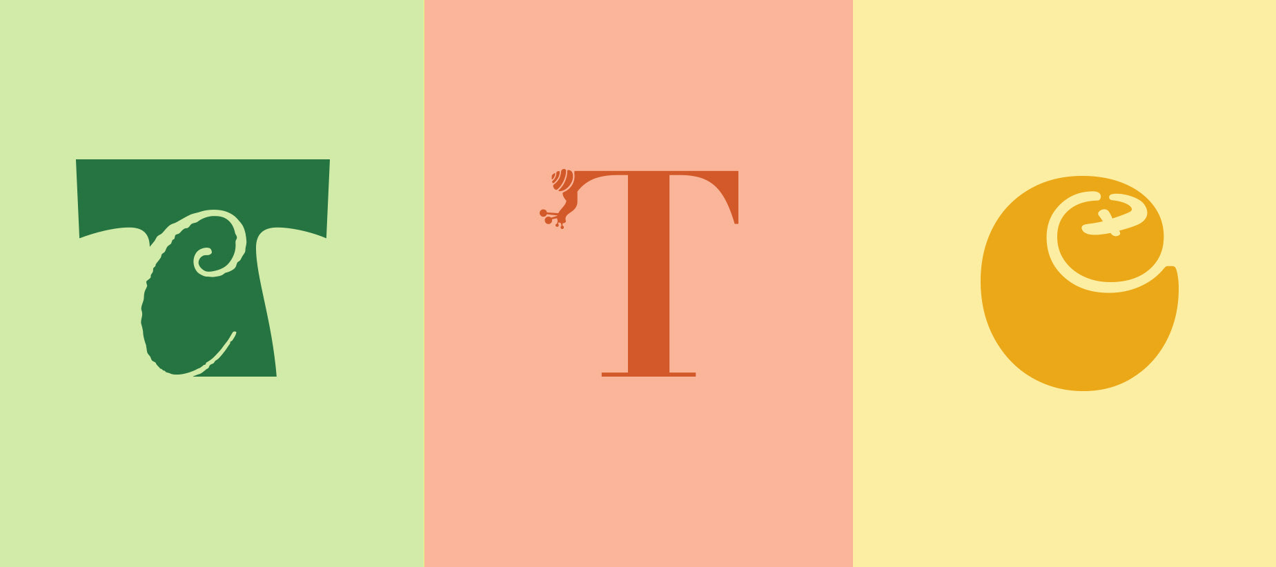
Monograms
These monograms were designed as part of a personal logo project. While I wound up going a different direction with that project, these three monogram logos were all strong and could be used in other applications. Two of the three combine my initials “t” and “c”. The first combines two very disparate typefaces. I started with the “c” in Bely Black. I liked the circular (rather than more open) construction of the letter. When I was looking for the complimenting “t”, I knew I wanted to tie the tail of the “t” with the open portion of the “c”. This meant searching for a very specific thickness and angle ( and even then I had to do some adjusting). The second combines a display typeface with a script one. The challenge here wasn’t in selecting the complimenting typefaces, but rather in finding a way to overlap them where both letters were visible and not creating any unpleasant tangents. The last monogram is leans into the humorous category and combines a very traditional serif typeface with a glyph (that came from one of the other typefaces displayed here). I needed a flat surface for the snail to crawl up and the serifs were perfect for that. I also enjoyed the dissonance of the traditional typeface with the more humorous snail. (2023)