Primary and alternate logo
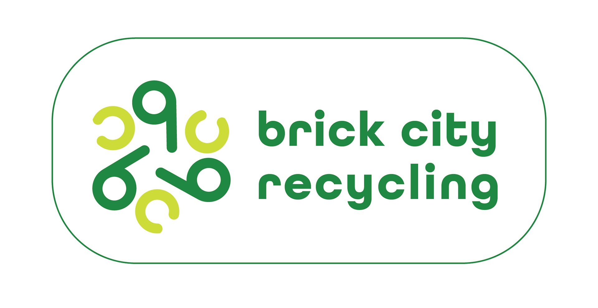
Brick City is the set of buildings which house the Art and Design programs on our campus. We were asked to create a logo for the recycling program in Brick City. For my logo, I choose a triangular shape for the letters b and c as an homage to the triangular shape of the universal 3 arrow recycling logo. The orientation of the b’s was triangular to mimic that shape. The color palette features two shades of green as a nod to the colors associated with recycling and environmental issues.
I paired this shape with the "brick city recycling text in All Round Gothic. The letters in the logo are custom, but have a similar construction to the All Round Gothic text used for the rest of the text.
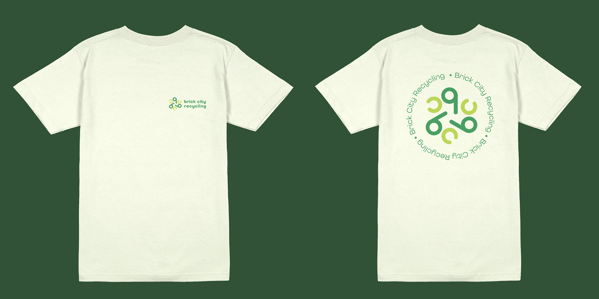
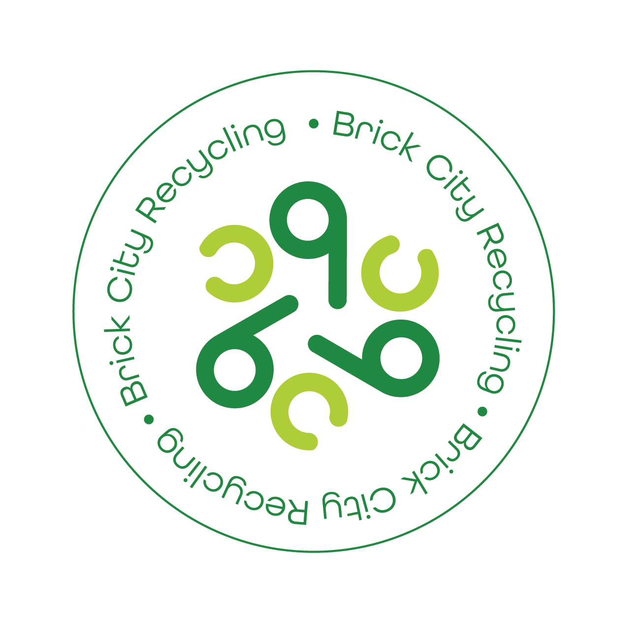
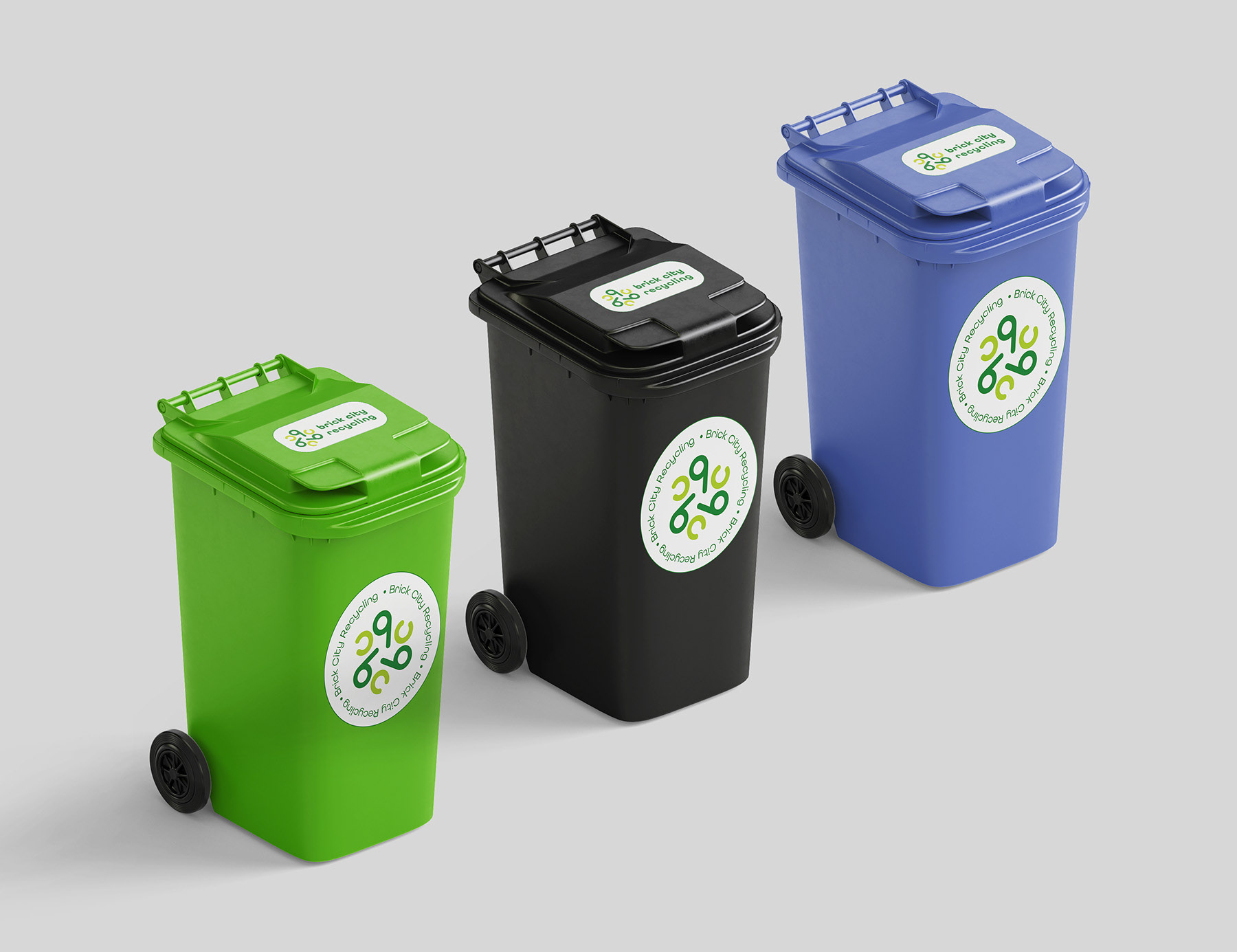
Above are the primary logo and an alternative that can be used in other applications like stickers, t-shirts and brochures. Either version of the logo can be used with or without the outline.
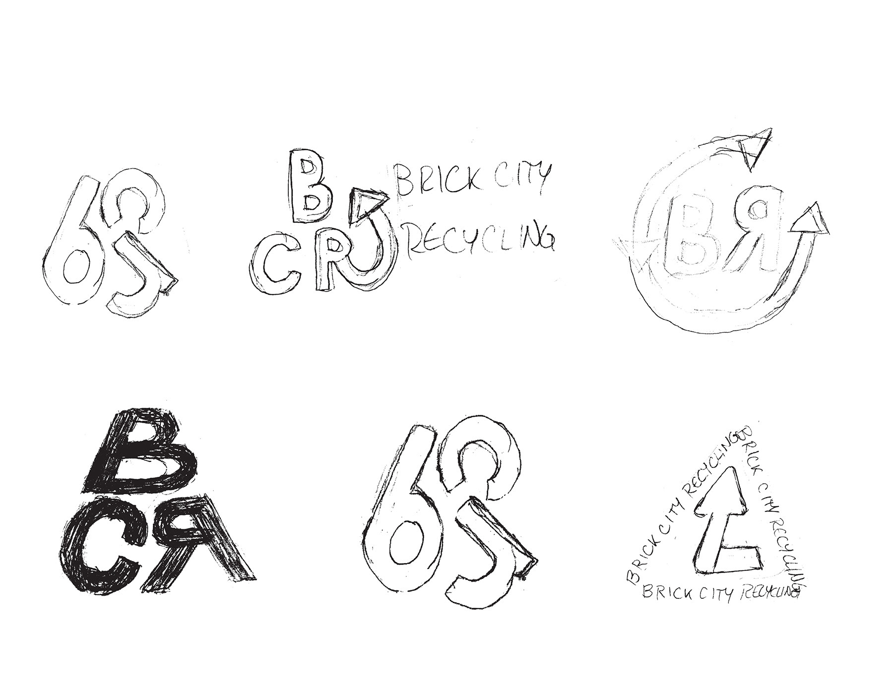
PROCESS-sketches
In my early sketches for this project, I was working with variations on the universal recycling logo (arrows arranged in a triangle).
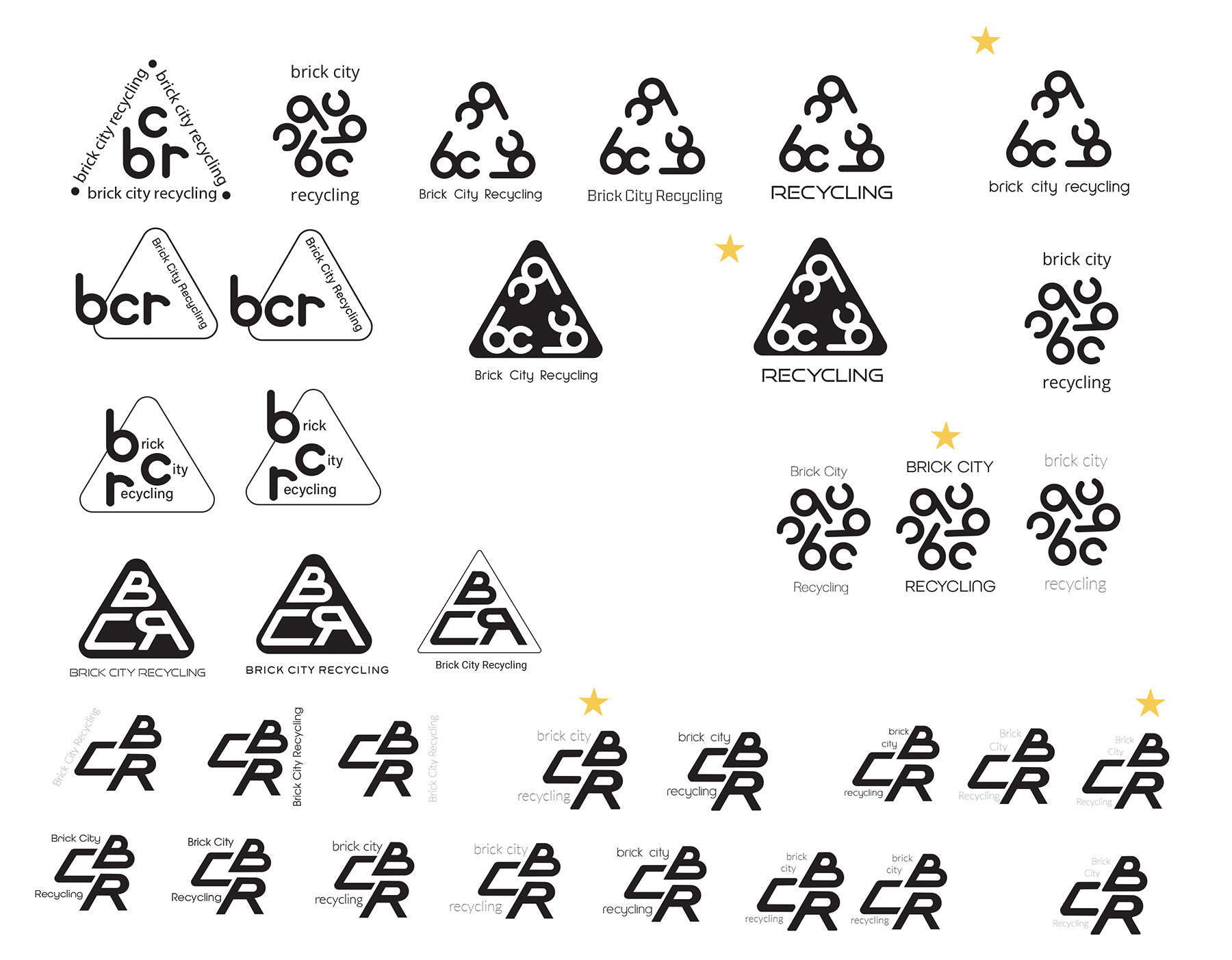
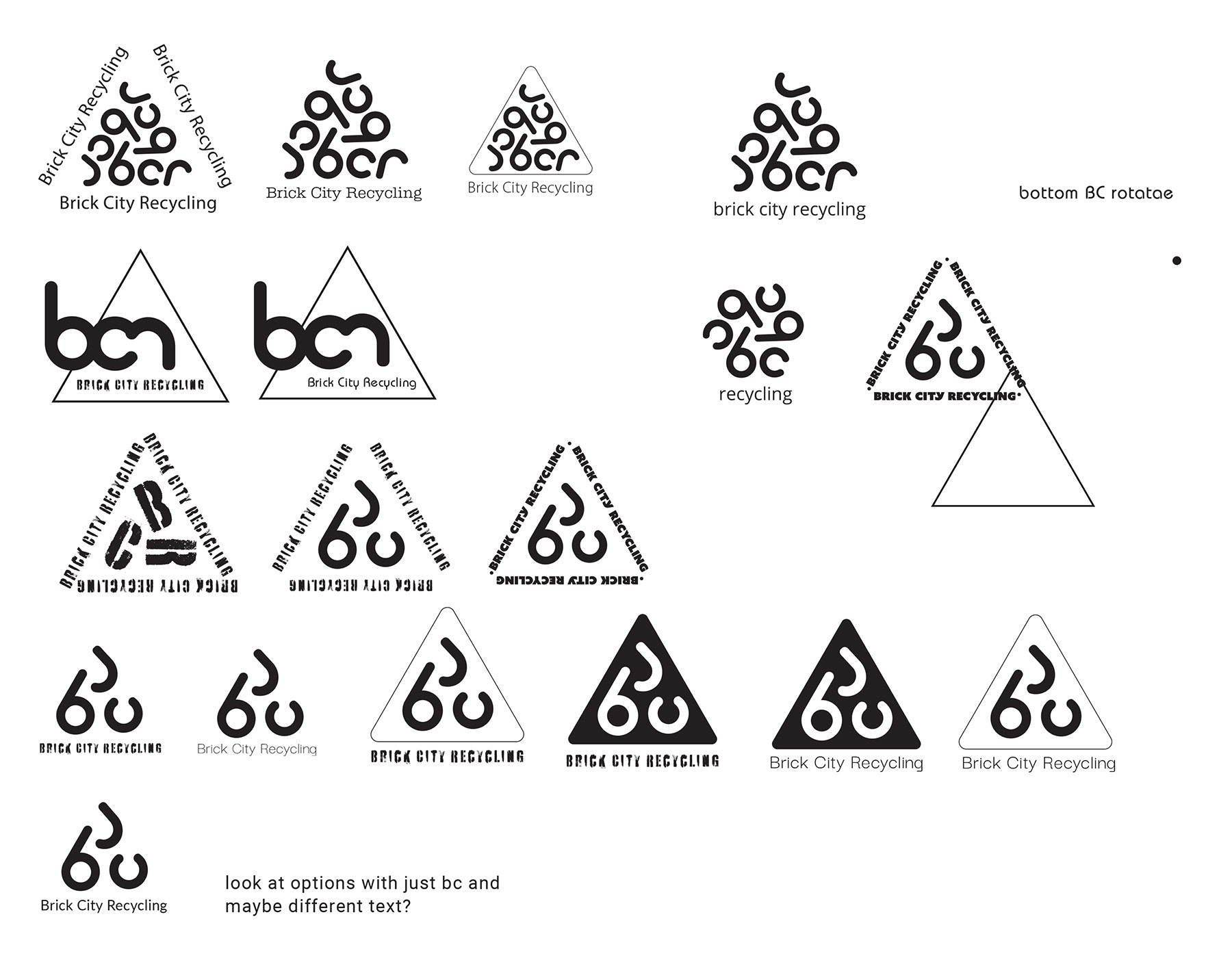
Next, I chose three concepts to refine in Illustrator. The idea in these explorations was to work with balance, alignment and proportion.
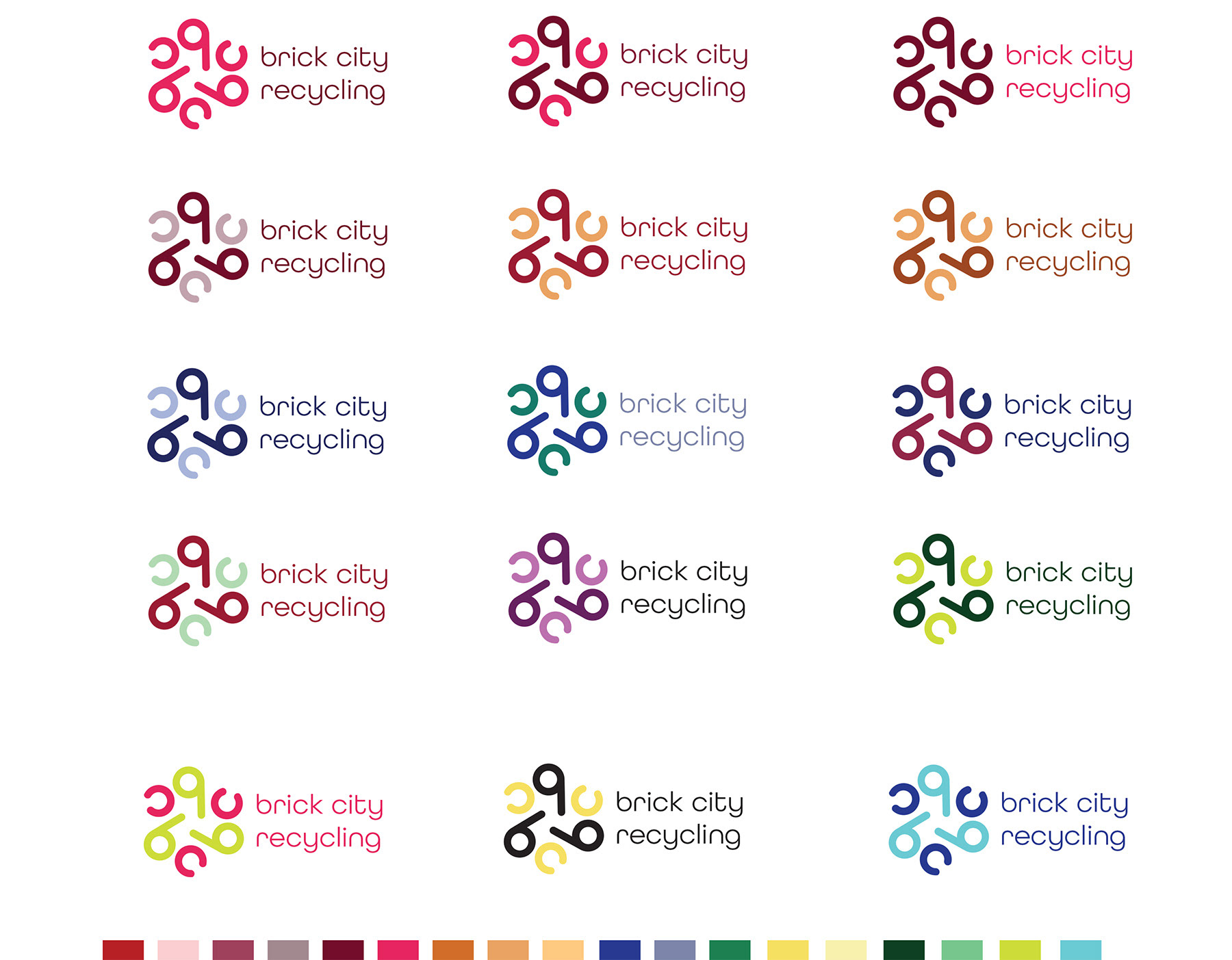
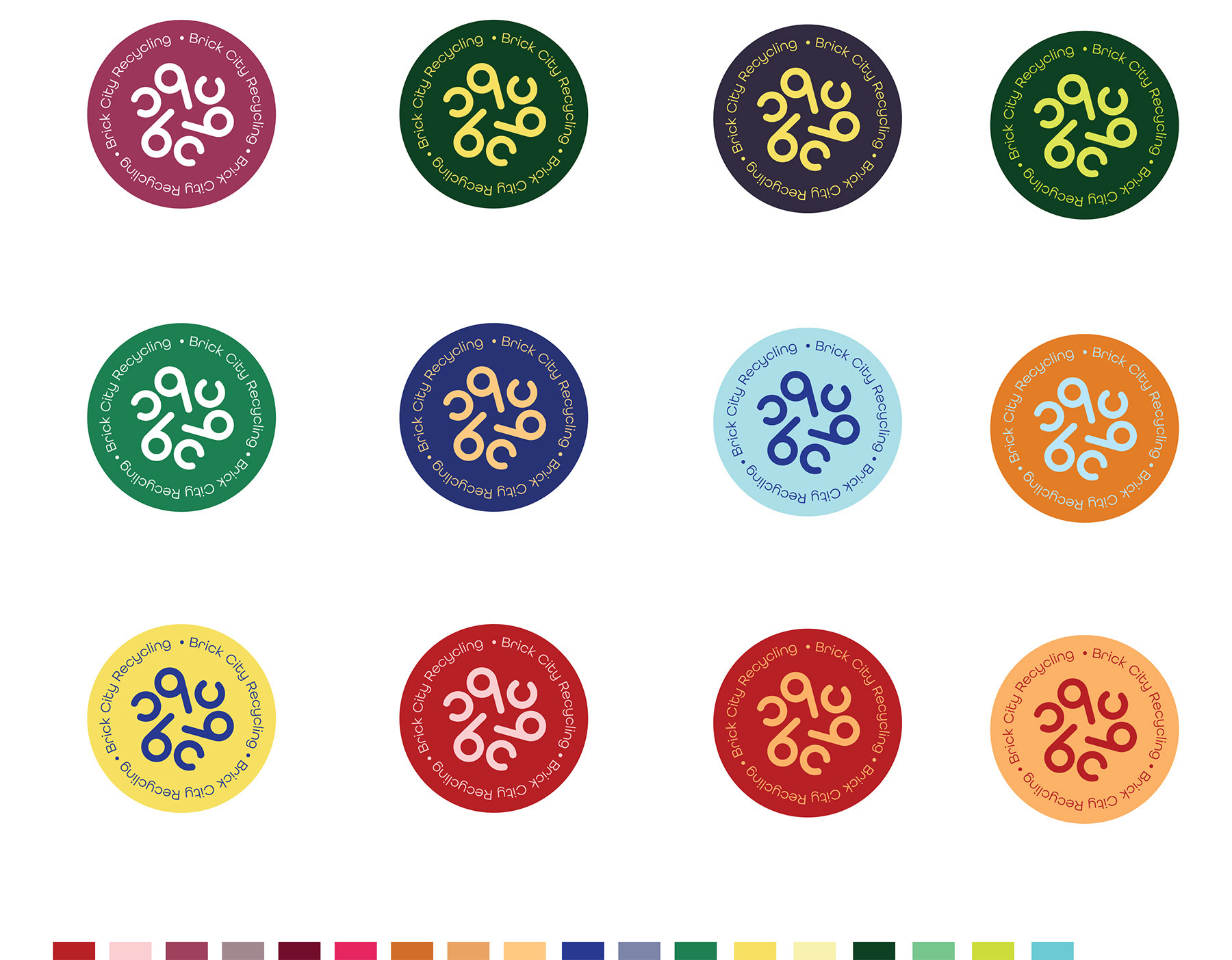
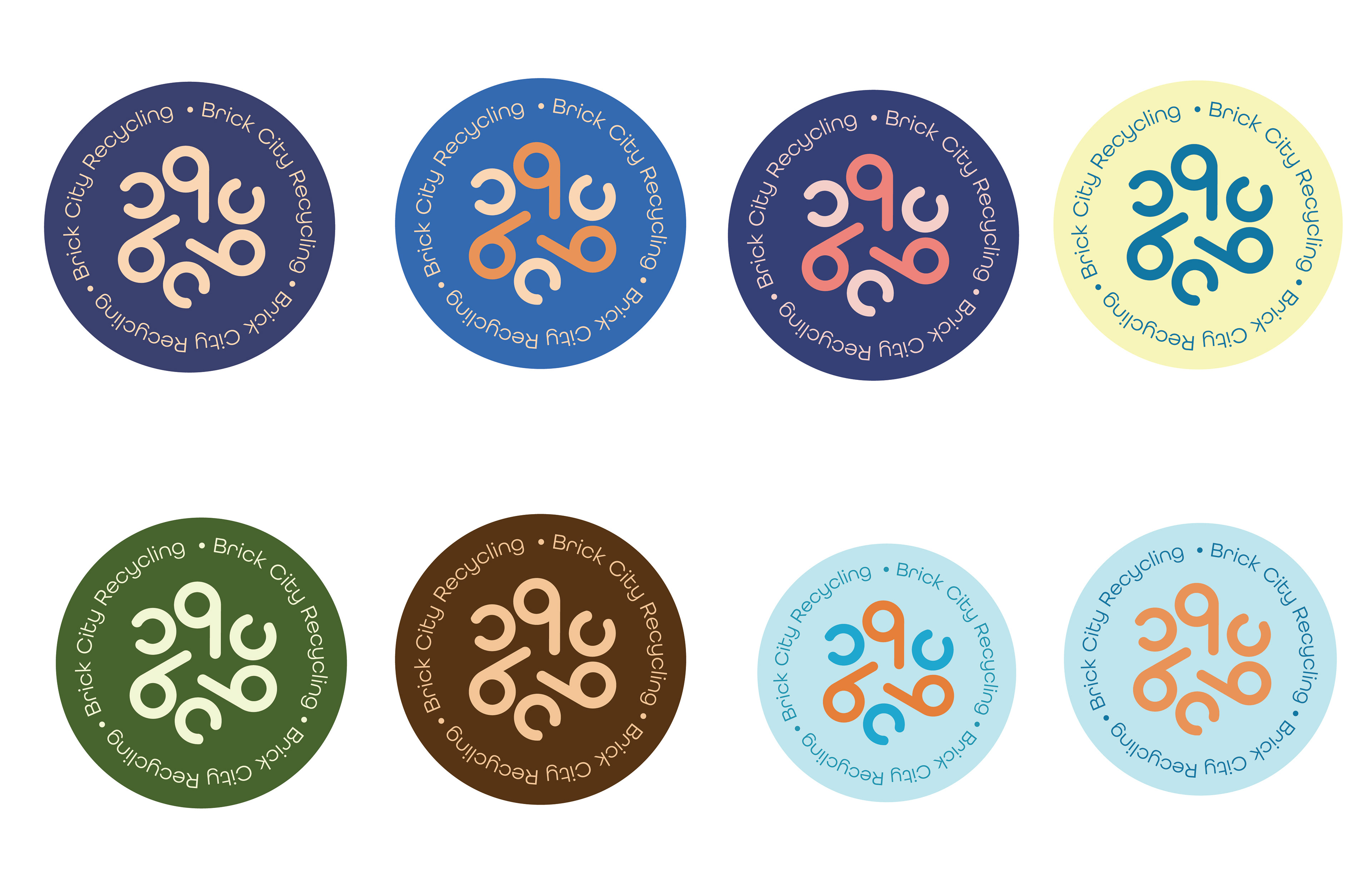
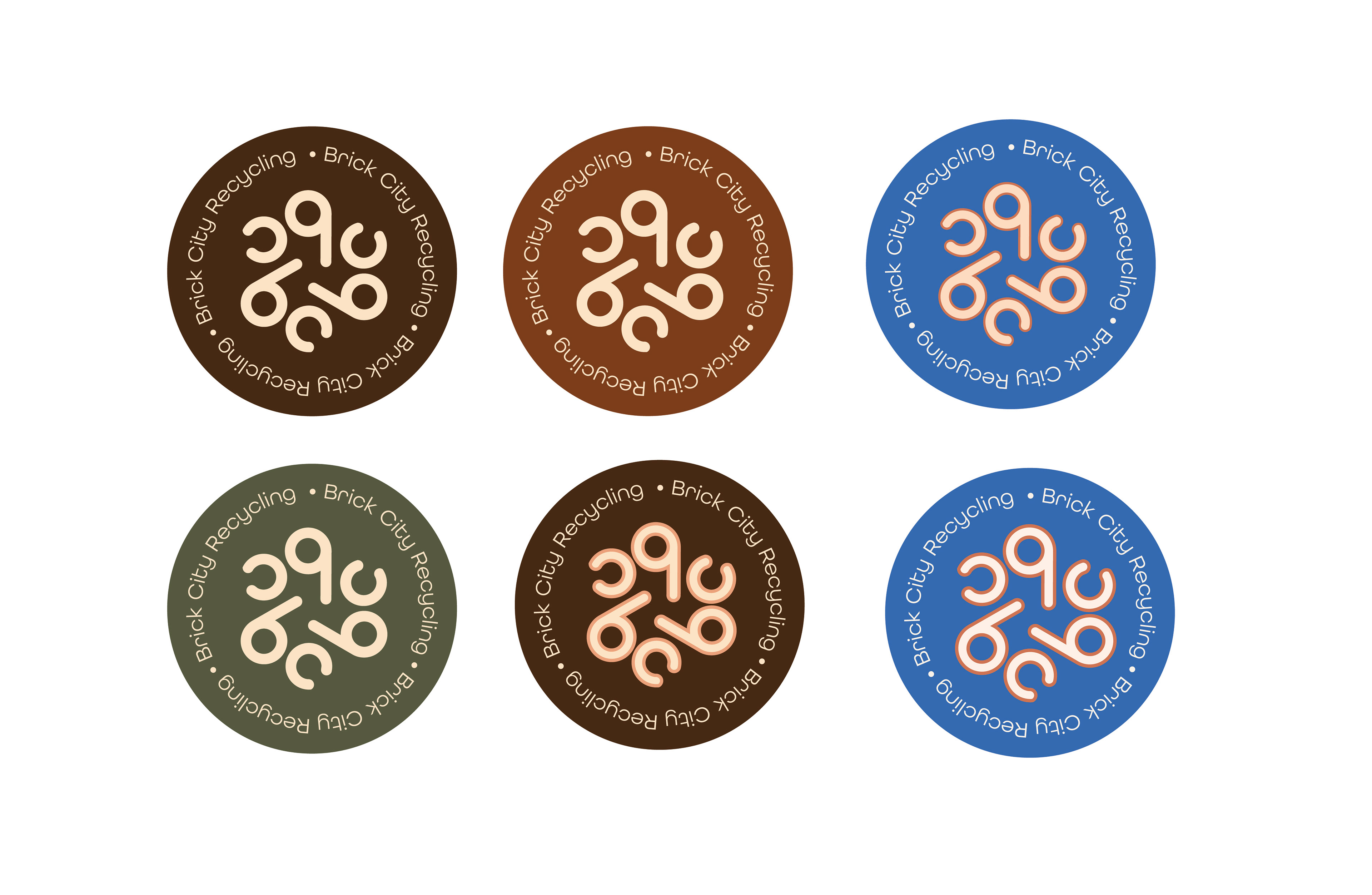
PROCESS-color variations
Initially, I wanted to move away from the blues and greens typically associated with recycling, though I did look at those, brick colors and school colors. Eventually, I decided to move toward earth tone colors, which led to the eventual solution.
When I first started color exploration, I wasn't sure which version of the logo would be the "winner". Ultimately, I thought both were strong, so I used both. The circular version can be used for assets like t-shirts and stickers and the other is the primary logo.